The last 10 weeks working on these four briefs have been
difficult, in that it has made me organise my time more, though I still need to
improve on it more next time. Looking back I can see that I spent much more
time on my first brief than needed and I wasn’t decisive enough so it took me
longer to get to an end result.
Because of this, I wasn’t ever just focused on my other
briefs.
At the beginning of the year, I was able to sit down with
Amber and ask her advice on how long I should spend on each brief and when to
start. This worked really well, because of my lack of decisiveness on my first
brief, this carried on throughout the module.
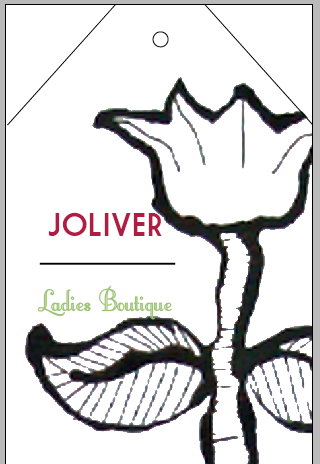
I think I worked quite well on my second brief, though I
think I could have done more research on boutique shops and visited some. But I
am pleased with the secret garden theme and the colour scheme of the shop and
its products.
For my third brief, I panicked and started it earlier than
agreed, and I feel that it has been a very rushed brief which could have had so
much more done with it, through its deliverables and research.
I was excited to do this brief at the beginning and in the
end it became a chore, and I got very uninterested in it. Looking back, I
should have probably changed it to another brief, something new and fresh that
I had a bit more interest in.
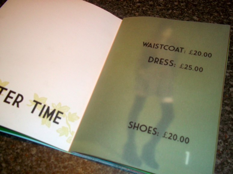
Even though I overran on my first brief (the fresh health
& beauty products) it gave me the chance to look into different kinds of
packaging.
After talking to Lorenzo, he encouraged me to look at
proposed packaging, rather than wasting time making one packaging and sticking
to it. I managed to get a lot more ideas across this way and in a short space
of time. This will be very useful in briefs to come.
If I could to this module again, there would be a lot I
would change.
I would do much more research and see more that is already
out there, for example, see more shops with beauty products and visit boutique
shops. This way I would have a better understanding of what is out there,
rather than searching it on Google.
I need to make sure I stick to the deadlines I set myself,
as I have found not doing this has a great impact on the briefs afterwards.
I really enjoyed working on the collaborative brief, and I
think we worked really well together and came out with a really good product.