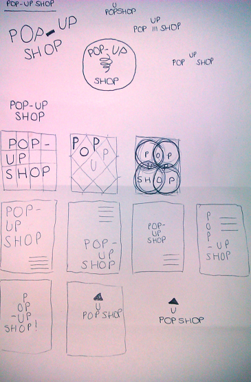
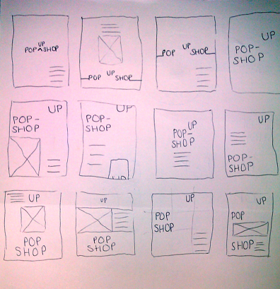
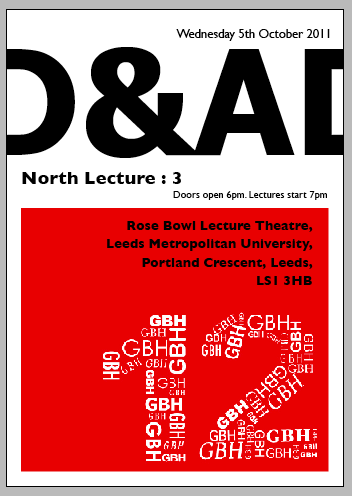
I wanted my poster to be purely type.. so I played around with the composition of words and came up with the above poster.. However, really not happy with it.. I feel there is far too many words, and I don't think it stands out enough..
Also.. need to look at past D&AD posters.. see what kind of thing they're looking for..
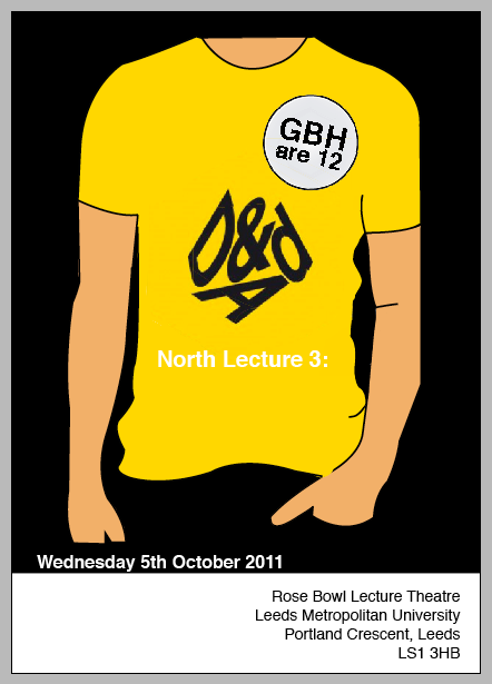
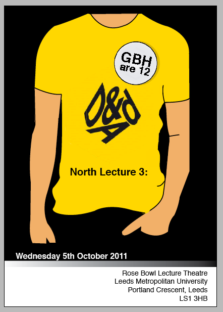
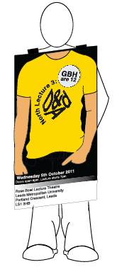
Decided to use an image.. Think it will grab attention better than just words.. the idea is a birthday badge.. on a person.. I have also included the D&AD logo, which I didn't before, which looks much better than my own D&AD title..
I'm not keen on the white background.. I don't think it makes the yellow POP.. as much as black would do..
And I need to look at laying out the information better.. it looks too jumbled and too much writing in one space..
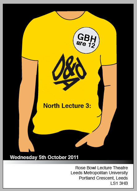
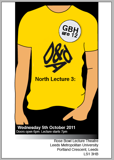
Now with the black background, I think it looks much better, I have also moved the text lower down so it's not all on the tshirt.. Just a problem with the 'north lecture:3' bit now.. Definately not good in white.. doesn't read very well on the yellow..
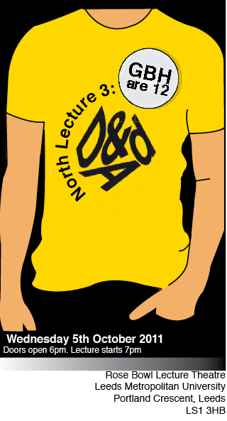
Added a gradient above the address.. just playing and works alright I think.. Also made the white 'north lecture 3:' black, which stands out better..
Just added a bit of shadow under the badge..
..And forgot to add some information..
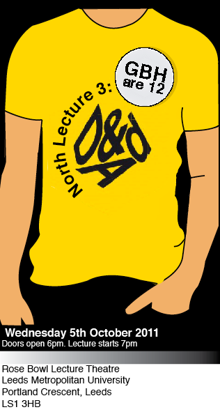
Taken away the two panels and made them white.. don't think it works right..
Was unsure about the 'north lecture' bit.. so tried to make it look more like the tshirt design.. make it flow nicer with the D&AD and badge.. think it works better..
And I've taken away the two panels on the side, so the poster is thinner.. less space.. I dunno..
Changed the address to the left hand side.. not sure which I prefer.. need to ask someone their opinion...
Added extra: To promote around uni and around..