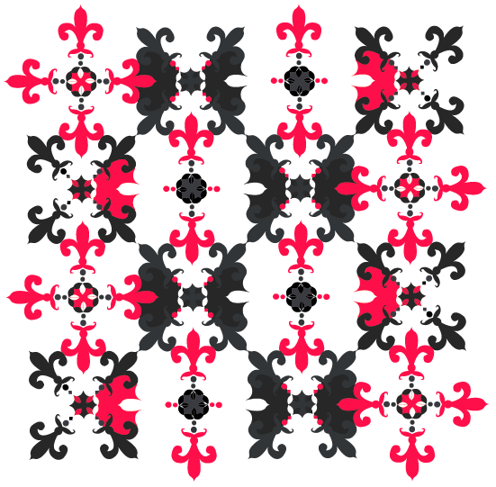
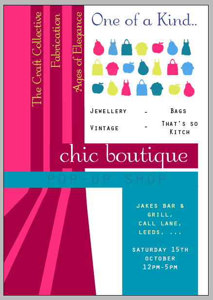
First idea above.. I'm not keen on the white background.. I think it's too garish like.. but I like the shapes..
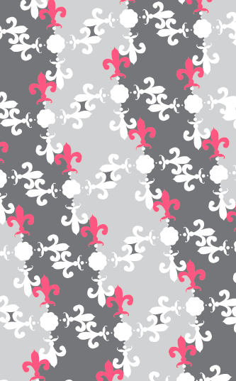
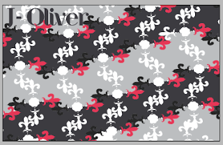
I changed the angle of the pattern slightly, and formed a pattern that way.. I have coloured the background in 2 greys.. which I think looks better visually, than just having one.. I need to change the dark grey bits that are in the light grey area..
Added the pink into the upright shape.. which is repeated..
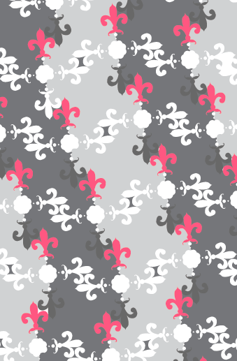
Then added a darker grey to the downwards shape..
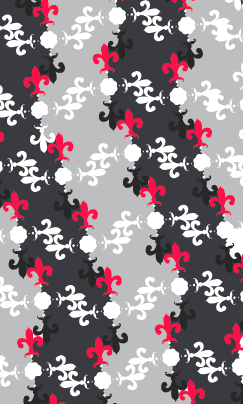
100% opacity - same colours but darker, like the first pattern experiment..
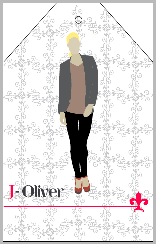
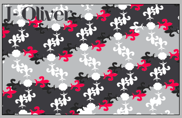
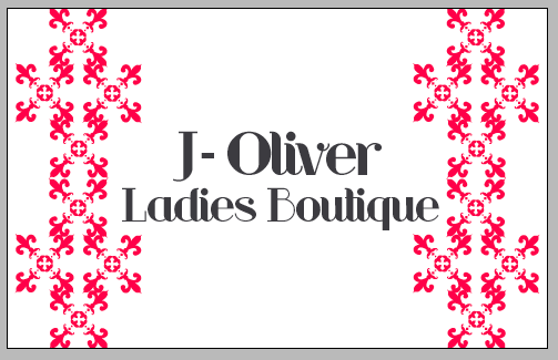
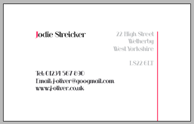
 Front
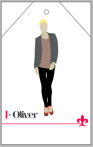
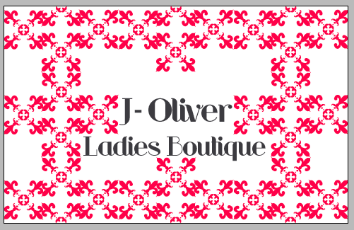
Front
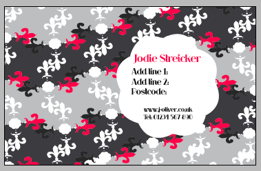
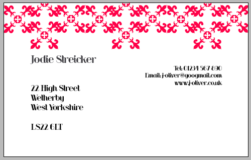
 Back
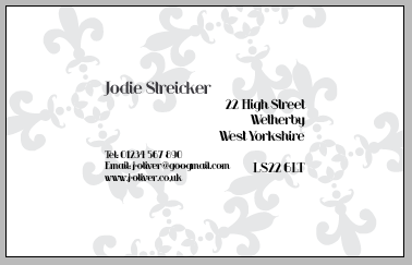
Back
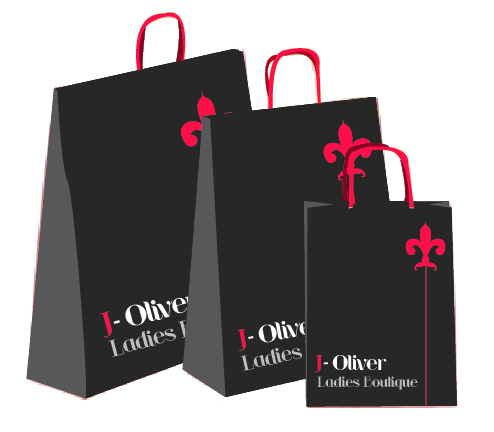
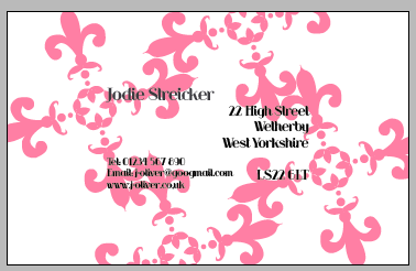
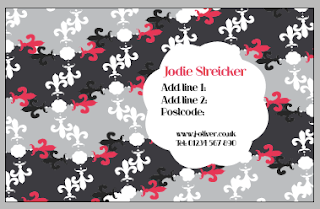
Transfered the pattern onto the business card.. not sure if it looks too busy.. maybe simplifying it the front of the card.. embossing the pattern? just one rather than it being repeated.. not as much colour maybe?? Need to decide on a second typeface, so that can be used with the 'J-Oliver' type..
Just getting stuck.. need some inspiration.. don't like how the patterns laid out.. from a distance.. looks like cross-stitch.. and colour?? it won't be printed onto white.. maybe more of a cream colour??
or
Meh.. still doesn't look right..
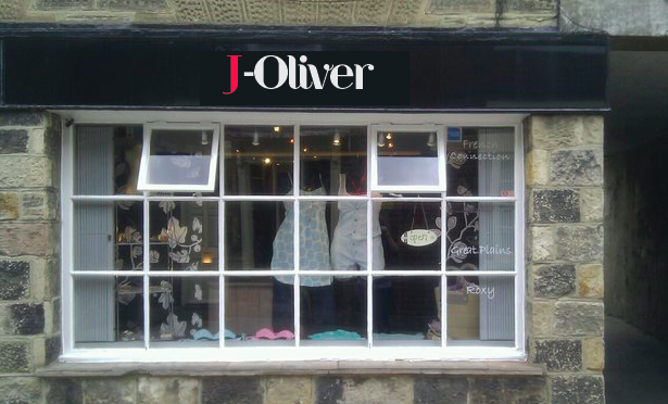
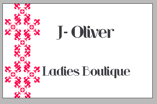
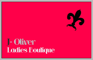
The grey and black is read better than the black on the pinky colour.. however.. I want some of the pink to be on it.. maybe like the pattern I did before..
Just no..
Something like..
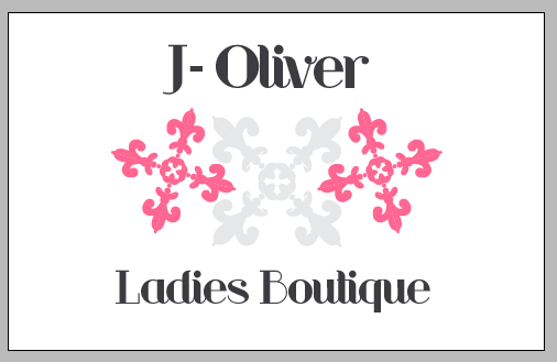
Not keen on the all pink at all.. too 'in your face'..
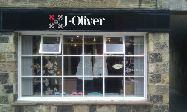
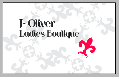
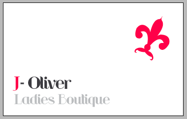
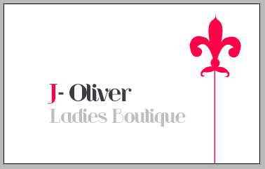
This on some nice card.. I think works.. and works well with the idea for the sign for front of the shop..
Okay.. so I don't think I need to change it anymore.. I really like this one..
And then to a letterhead:
Complimentary slip: