Wednesday 30 November 2011

Bacardi Fruit

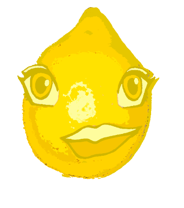
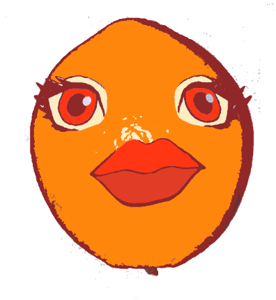
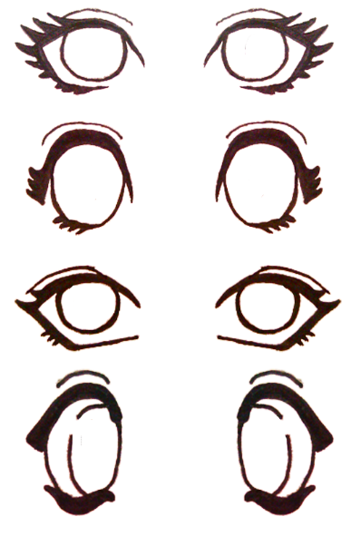
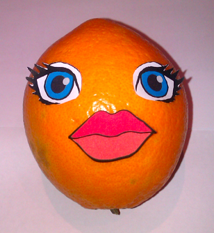
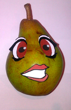
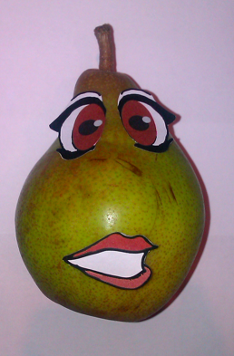
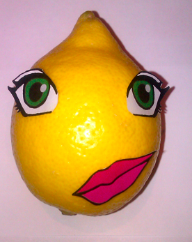
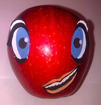
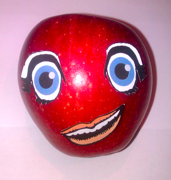
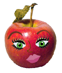
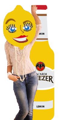
I have photoshopped the fruit and 'posterised' them myself.. each has 4-5 colour.
I think they look a bit more 'cartoon' like and playful, and looks better than the different colours.
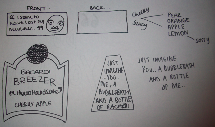
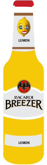
They reflect the colour of the drink as well.. so it would match up with that too..

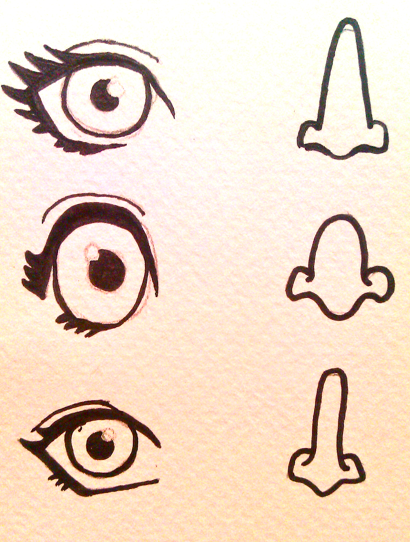
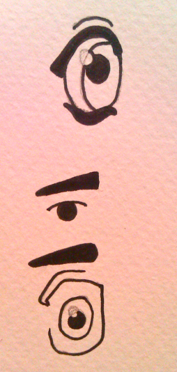
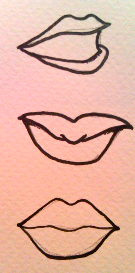
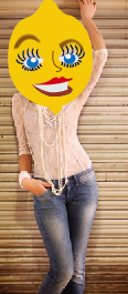
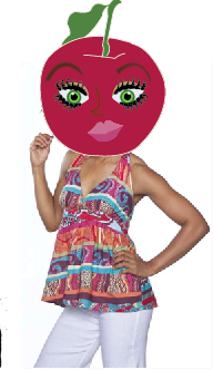
They are all designed in the same way, but I think that they show different kinds of people.. a 'tomboy' character, 'sexy', 'attitude' and 'bubbly' personality.

As a quick thought, they remind me of traffic lights as well, which could be a themed night.. this was already done when I was looking at past designs.. however, this one would be slightly different, with the fruit being the colour, not traffic light..


Ideas:


Tuesday 29 November 2011

Google:

[Brainstorming]

Poster/Banner designs..


Need to look at more variations of layout and colour.. but as a quick idea..


Making the background look a bit like the bacardi breezer logo..

Wednesday 23 November 2011

The Characters:

I want to look at making characters a bit like potato head.. but using illustrative features. I think this will look fun and bring out the character more.


I only drew one eye, as it can be reflected and I wanted them to look very feminine, as I am doing female characters.. However, these characters could be made to be male, so that would be more for the women who drink Bacardi.


The bottom two eyes are a bit too manly to use I think.. but would work on the male characters.


I think all the mouths work, I like the fuller lips more, shows femininity more as well.


The eyes once they have been photoshopped.. I think all of them are feminine eyes, and work well..


Fruit faces:

I picked out the fruit and stuck the features onto them.. I found that putting the eyes and mouth in different places completely changed the way the fruit character looked.. so I experimented with this abit..


The marks on the pear gives it some character, looks like a face shape too..


I think the bottom lemon works a bit better than the top.. the eyes and mouth are in a better place..


After talking to people, I realised that there is far to much colour going on.. and I needed to limit the colour palette a bit..

Monday 21 November 2011

Design ideas:

I quickly drew some packaging ideas.. just something the packages could be to make them a bit more interesting.. 


I have focussed on the icons, after talking to nick and seeing some of his ideas, I have come up with my own.. I realised after looking at his design boards, the packaging looked better when colour was used.. so I have done that..


The christmas calendar in the middle would be a huge wall piece, and reveal a piece of packaging to the run up to christmas..


[scan design boards and brain storm..]

Friday 18 November 2011

Logo for music festival:

Logo design for the festival..
Would be seen on the limited edition bottle/labels as thats where the limited edition will be seen..


I think there's too much looking back at it.. just needs to be quite small and more simple..


Wednesday 16 November 2011

Packaging Design Boards


To show what my range looks like.. 

Fruit Characters


I have drawn out my own facial features.. and put them onto a photo of a fruit.. I have then traced the fruit and just used one simple colour .. which is still obvious what fruit it is.. but I quite like the detail of the fruit and that its 'real'..

I want to look at physically sticking the features onto the fruit.. and photographing it.. but for now, I am going to just work with these to get some deliverables..

Just going to start off with 2 characters at the moment.. as I will most likely be changing them to make them better anyway.. but need to show the deliverables.. and how they fit in with it..

Basic layout:


I need to draw some out by hand and get some ideas that way.. Where to place the character on the bottle.. if there are some new words/a phrase.. where to put it..

Putting the fruit heads on bodies.. look more like they're flirting.. one on left a bit to slaggy like.. but just for the idea.. I will find more 'classy' photos.. that would be seen in a high end fashion shoot..


How will these images transfer to Bacardi?


Need to get some drawings of ideas of how the characters will fit into the promotion..